Graphic design & Illustration
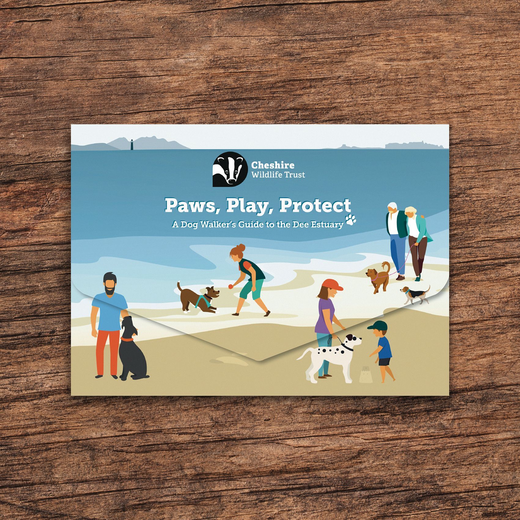
Paws, Play, Protect
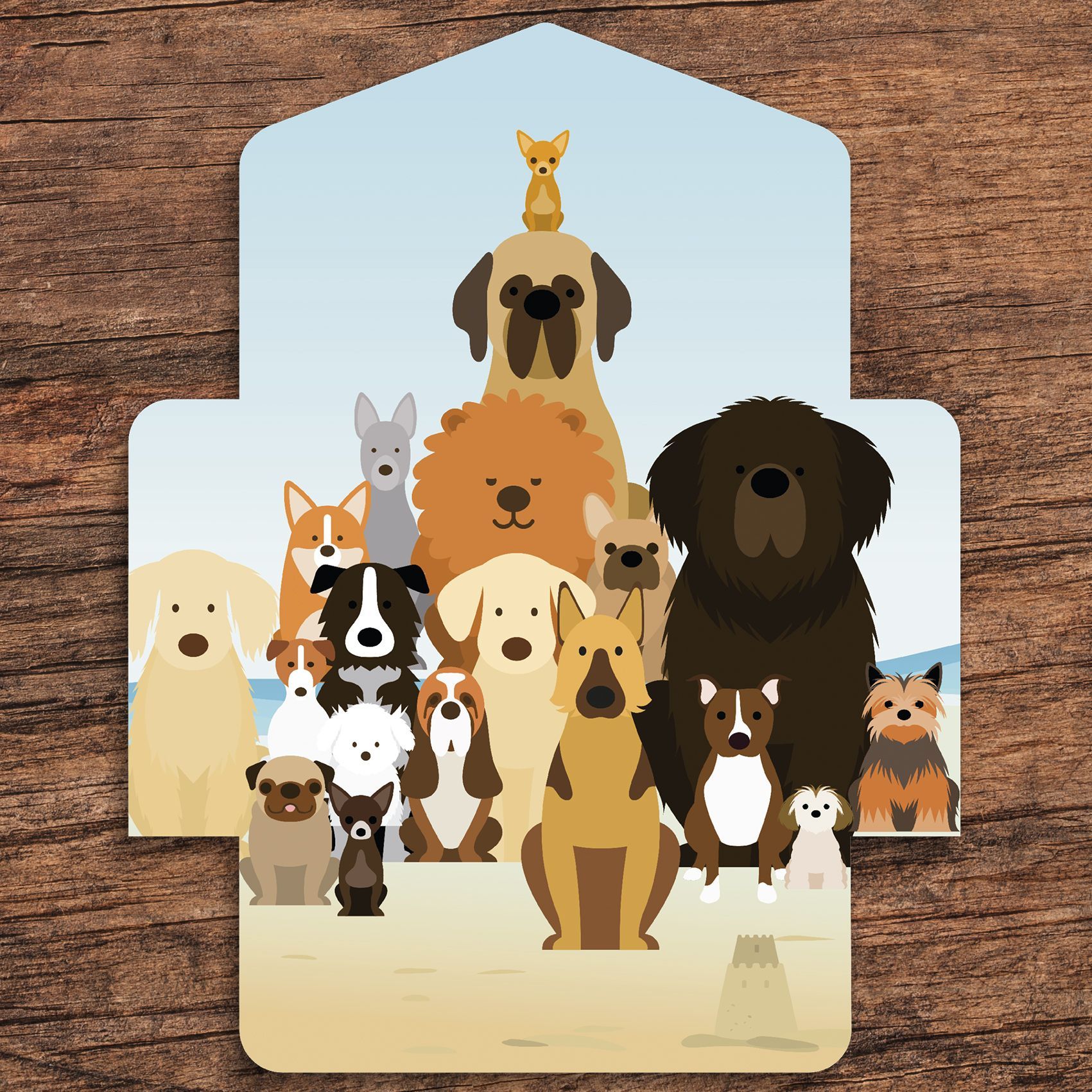
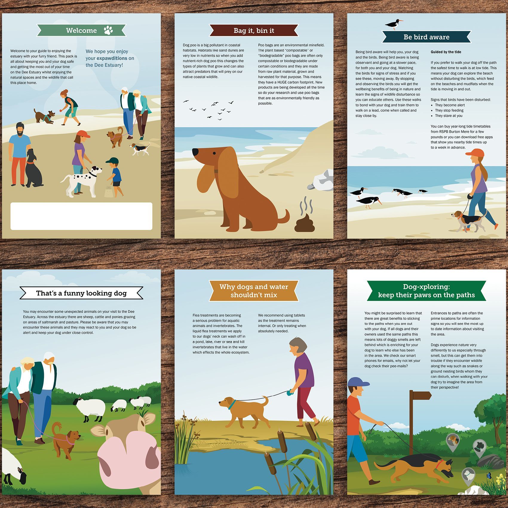
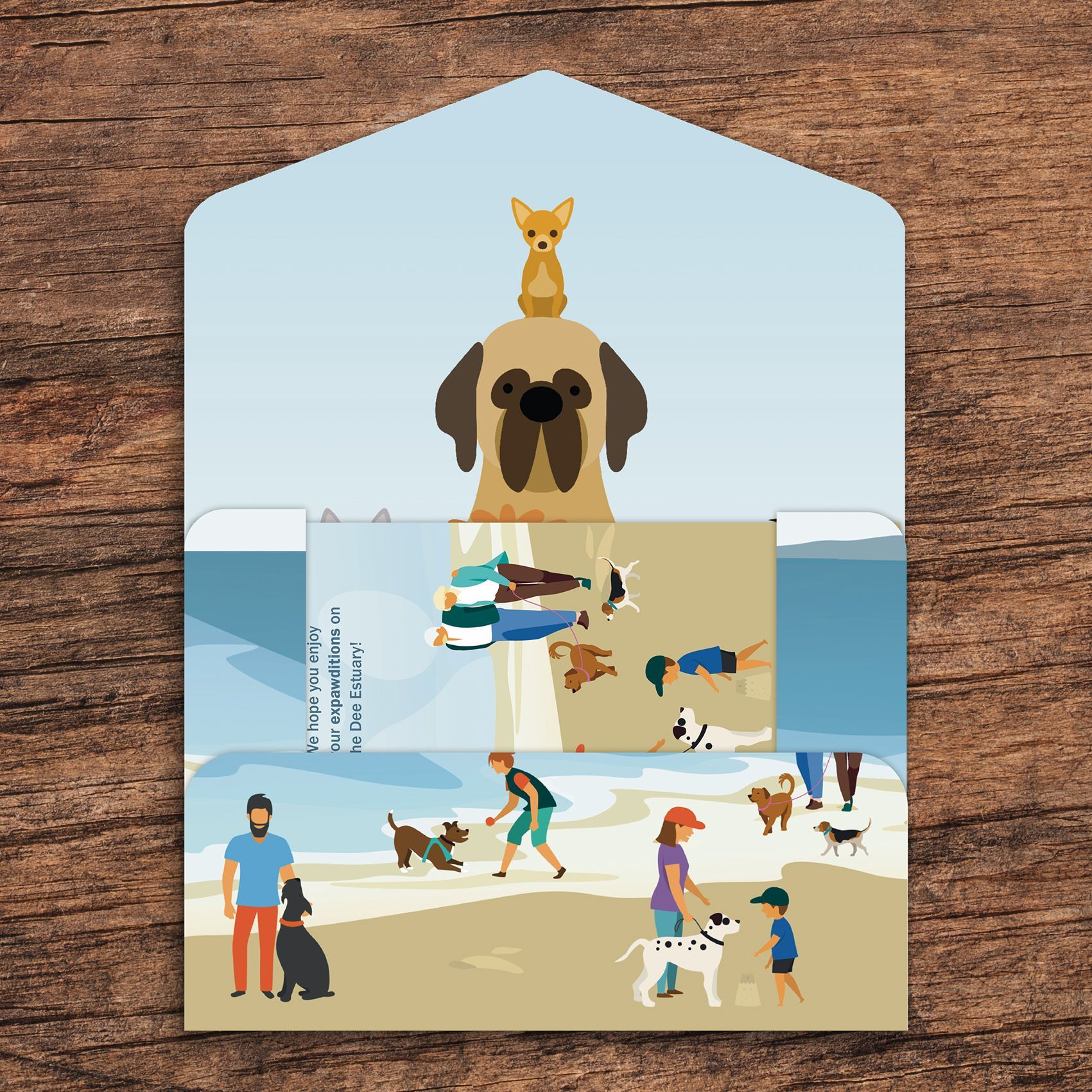
A fun but also educational project for the Cheshire Wildlife Trust, highlighting important but sometimes overlooked aspects when visiting the Dee Estuary with a dog.
As a dog owner myself and having visited the esturary many times, this was a project close to my heart.
The brief
The Cheshire Wildlife Trust wanted to create an appealing and informative envelope, plus inserts to guide dog walkers through their visit to the estuary. The focus is on keeping both visitors and the local wildlife safe.
Graphic design
The Manor at Greasby
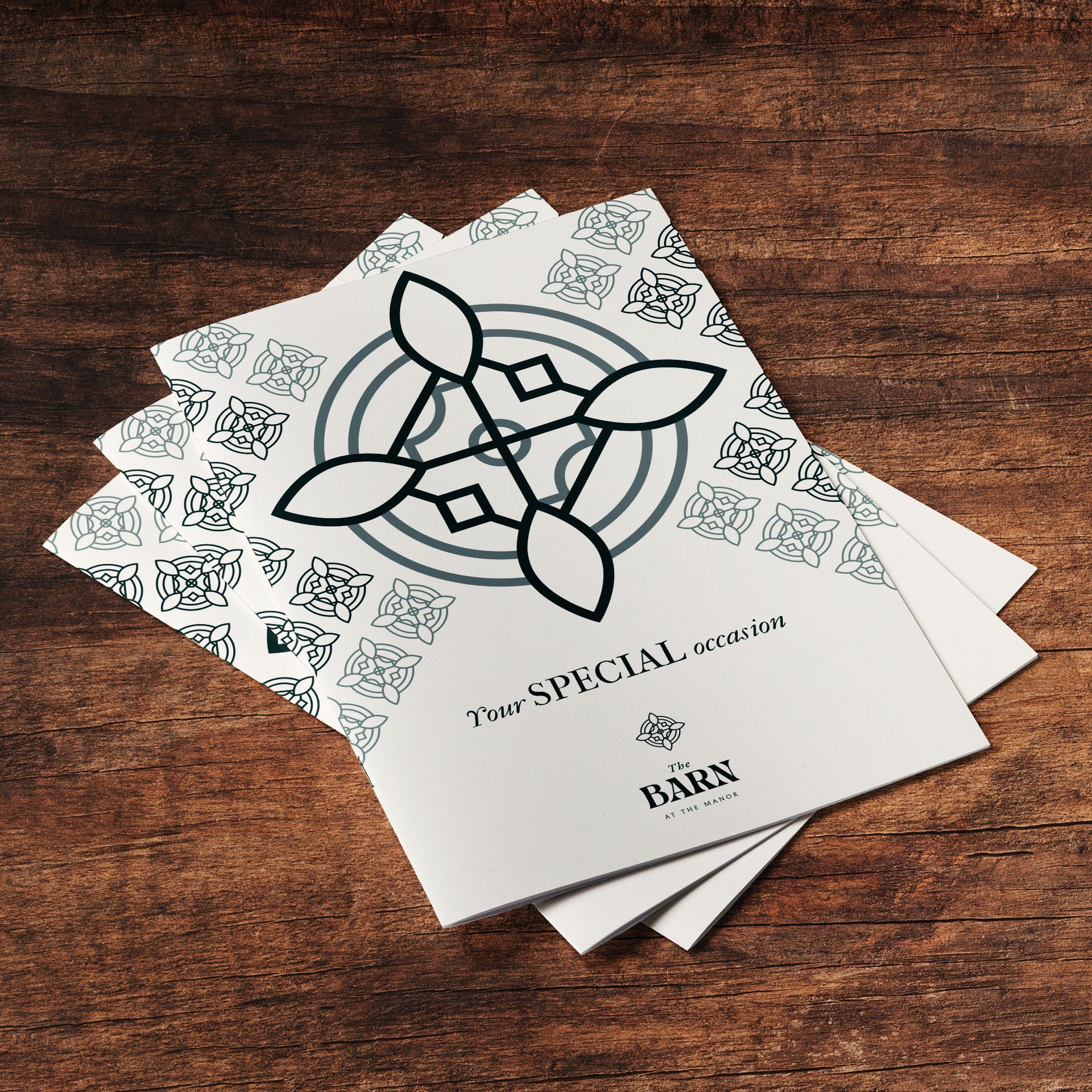
The latest addition to the Nelson Hotels & Inns properties, The Manor is a centuries-old manor house, reimagined with a comfortable yet contemporary new look, to enjoy seasonal all-day dining. The Barn at the Manor completes the venue as a destination for elegant weddings or special events.
The brief
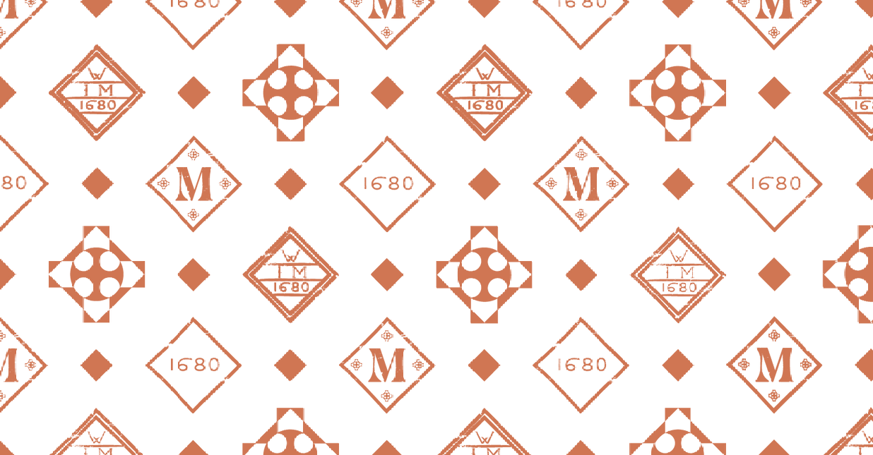
The task was to bring the existing, newly designed brand to life and create a coherent and exciting visual appearance.
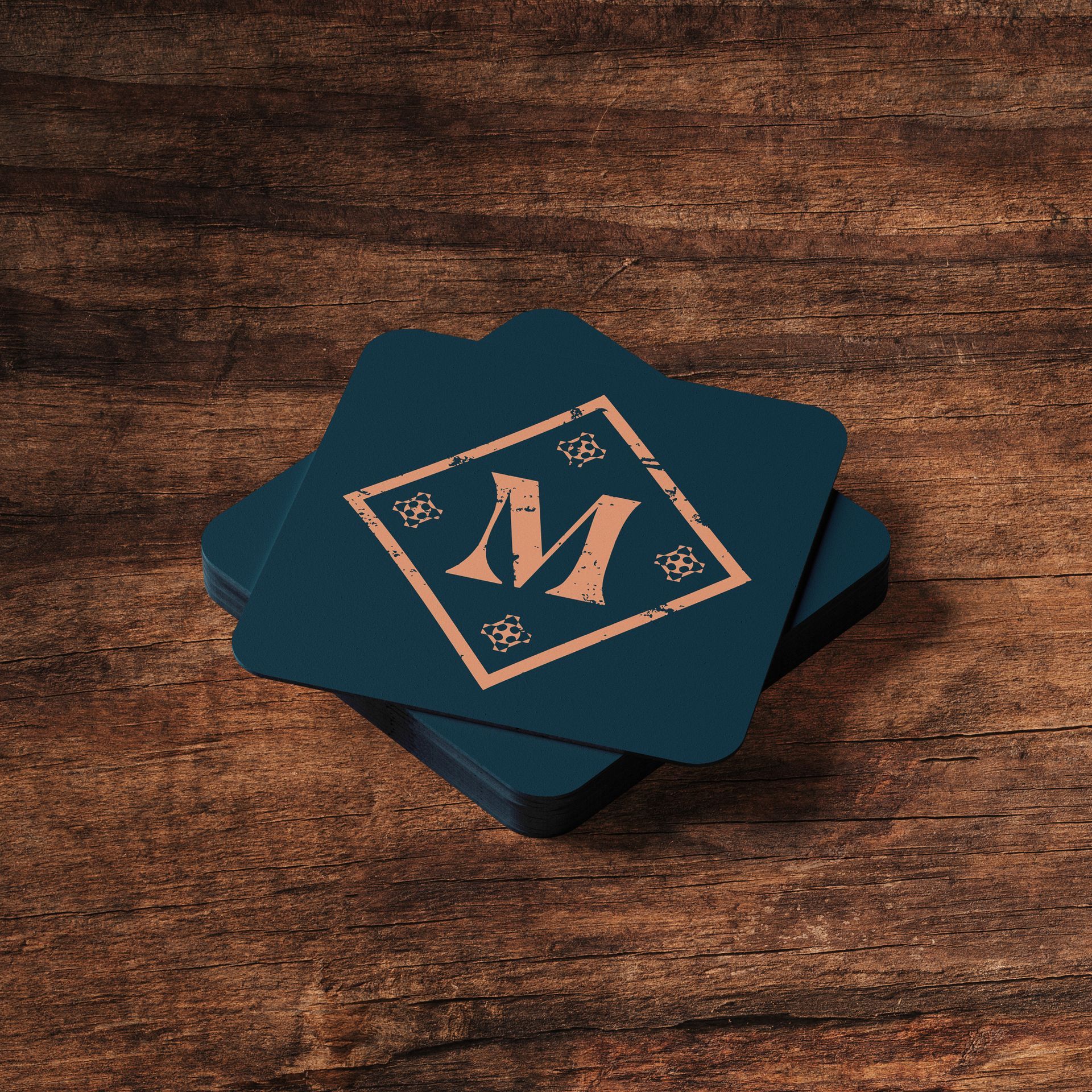
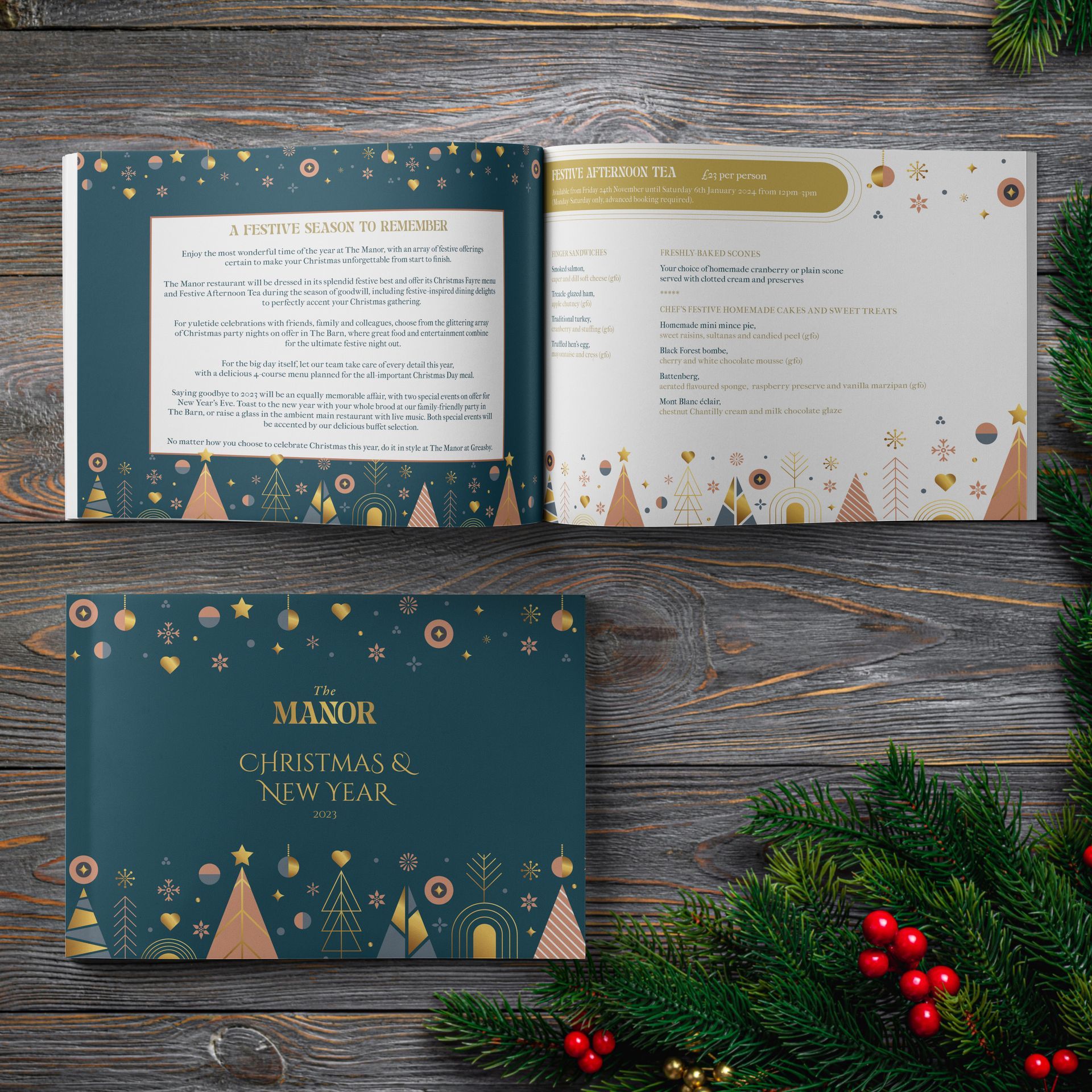
From day-to-day items, like menus, coasters and stationery, to the more special print projects like wedding and Christmas brochures, advertising and menus for special events, this is an exciting and divers ongoing project.
Interpretation boards and Illustrations
Cheshire Wildlife Trust - Dee Estuary
The Cheshire Wildlife Trust manages and protects huge swathes of land and areas across the Irish Sea and Dee Estuary.
The brief
The Cheshire Wildlife Trust wanted the design of three family-friendly interpretation boards explaining the heritage and history of different sites.
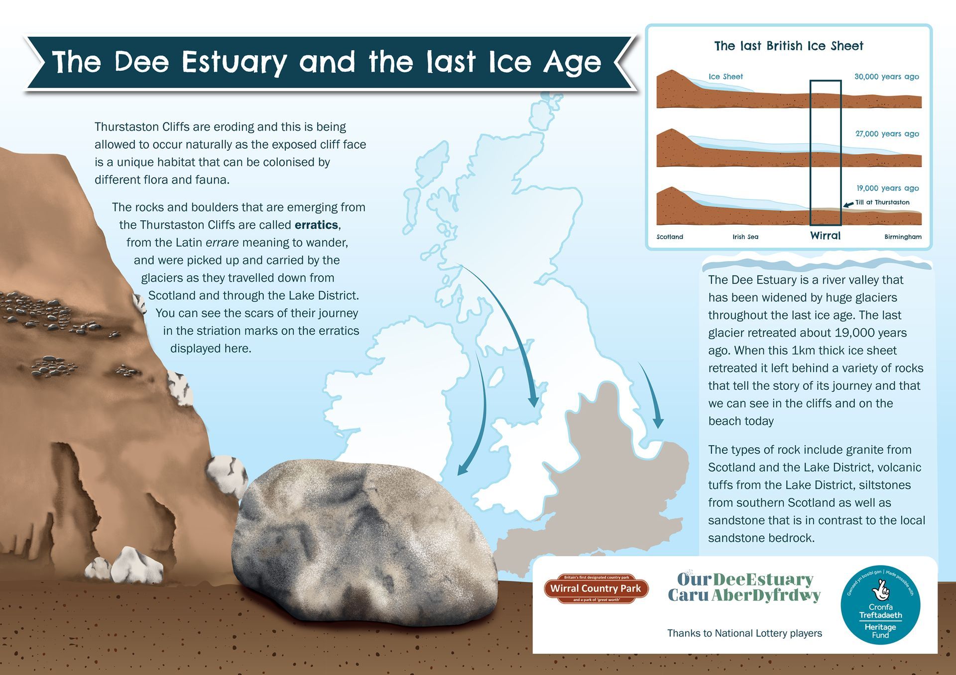
- The Dee Estuary and the last Ice Age
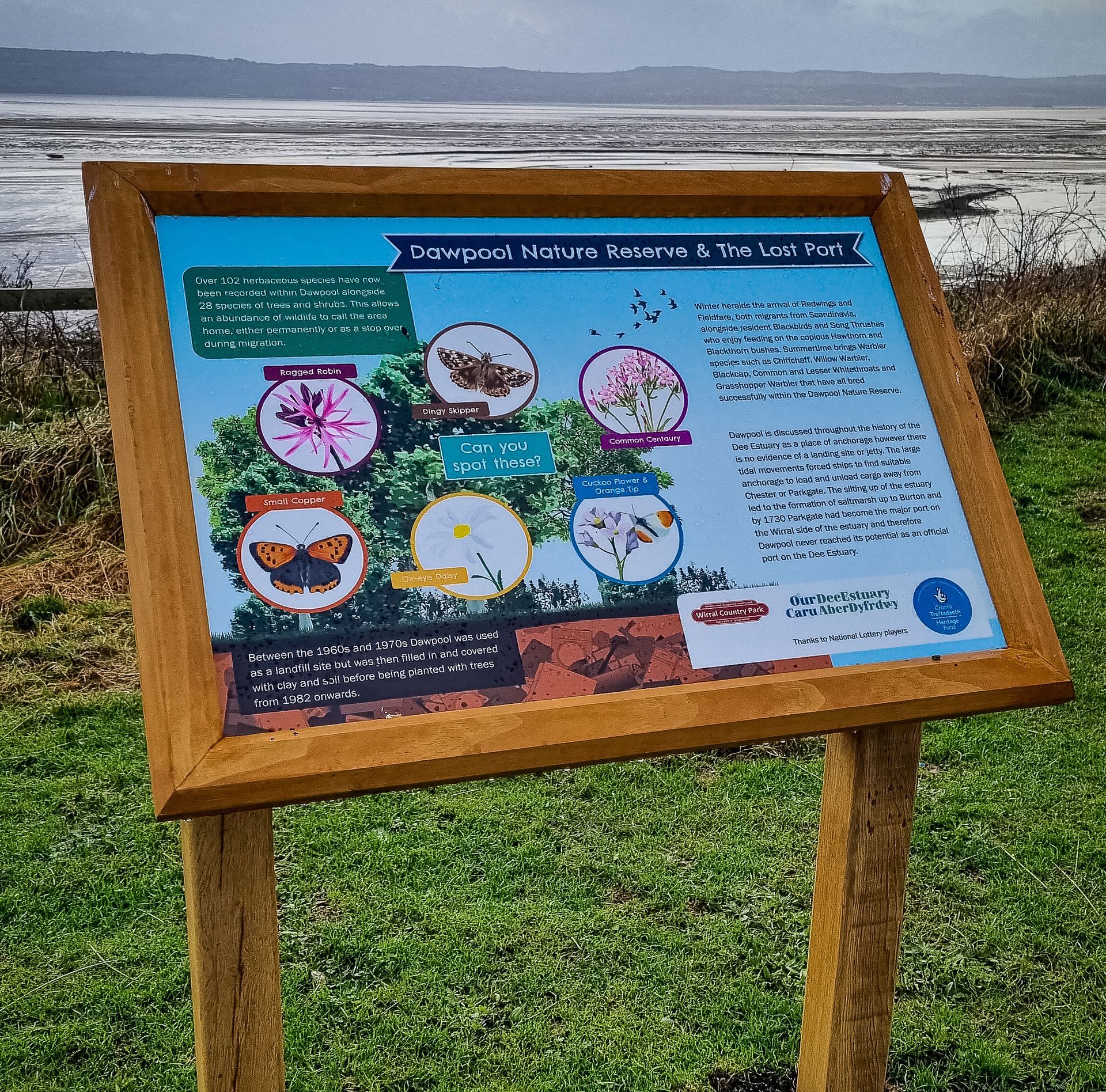
- Dawpool Nature Reserve and The Lost Port
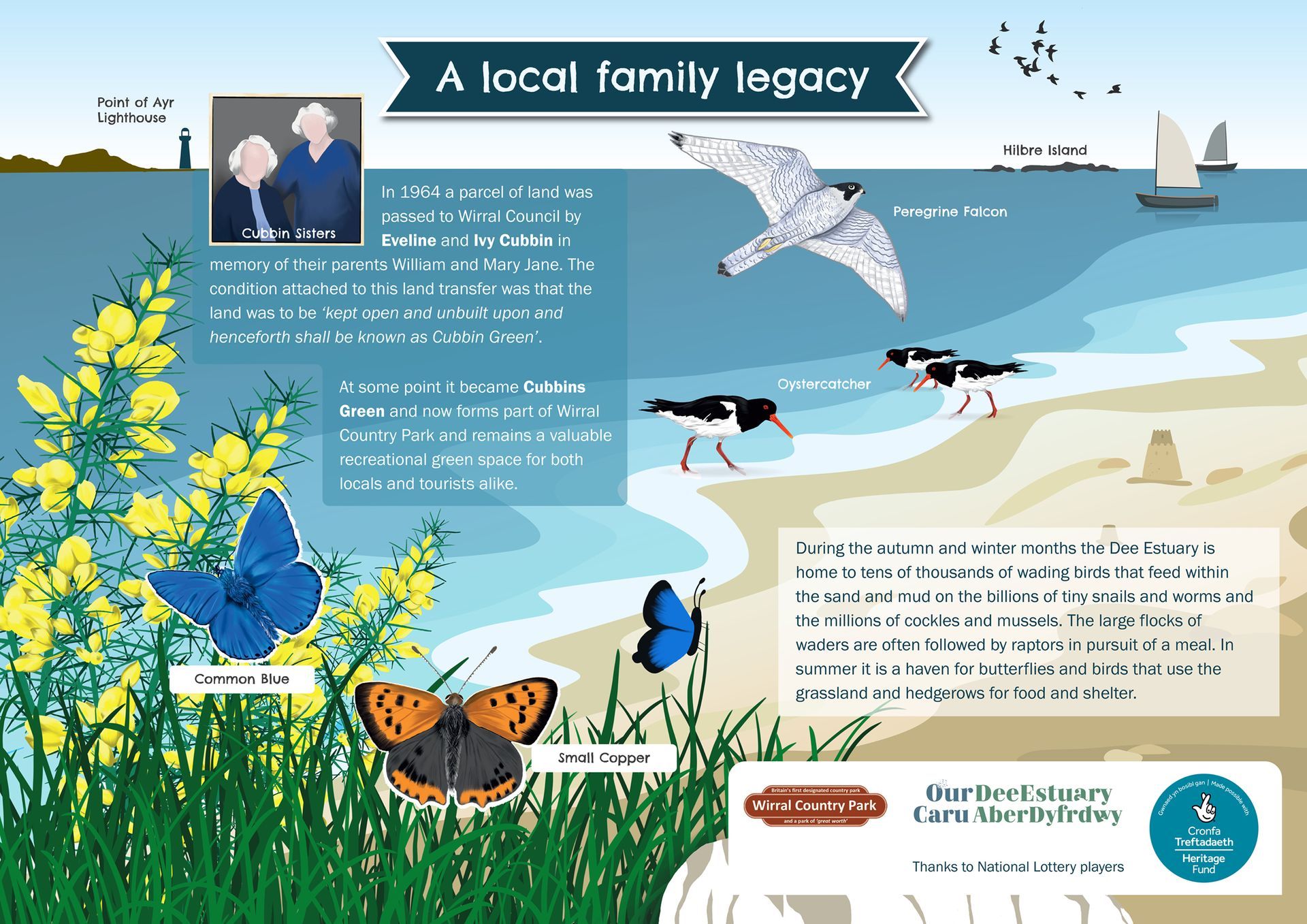
- A local family legacy - Cubbin's Green
Together with the design of the boards, naturalistic illustrations of wildlife and other features were created to explain these exceptional sites.
Illustration and graphic design
Killesberghöhe, Germany
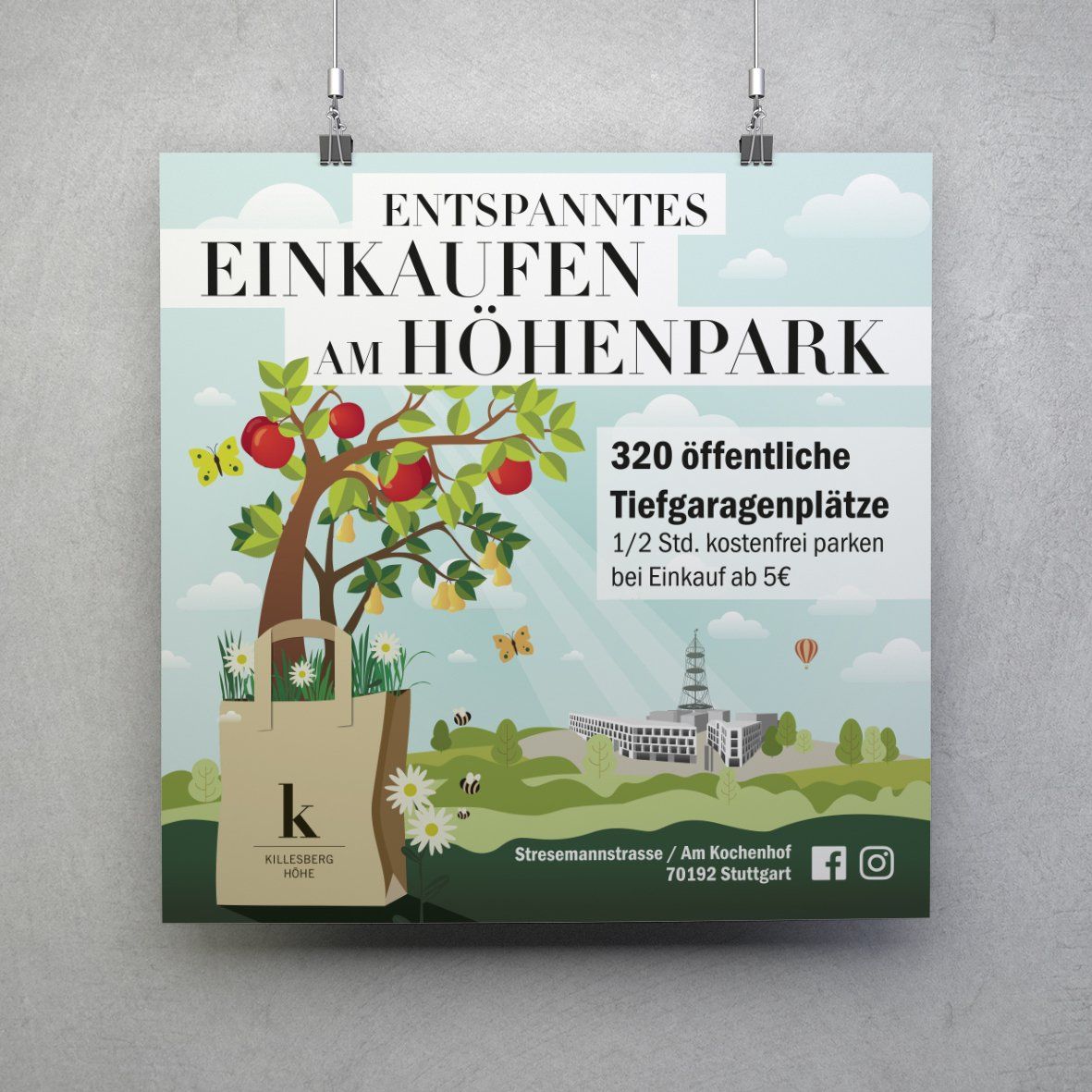
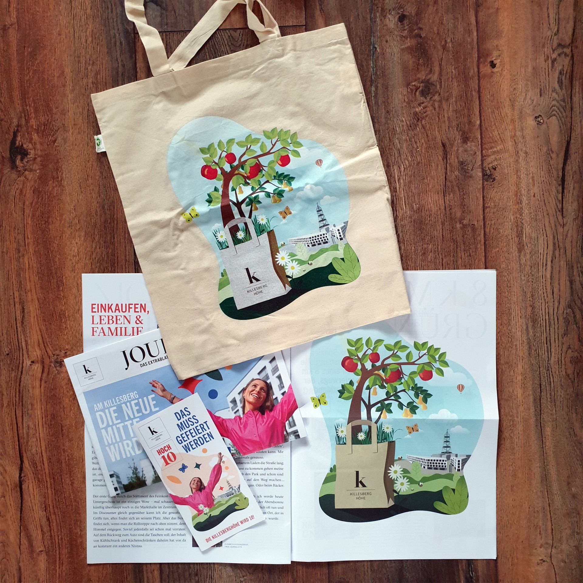
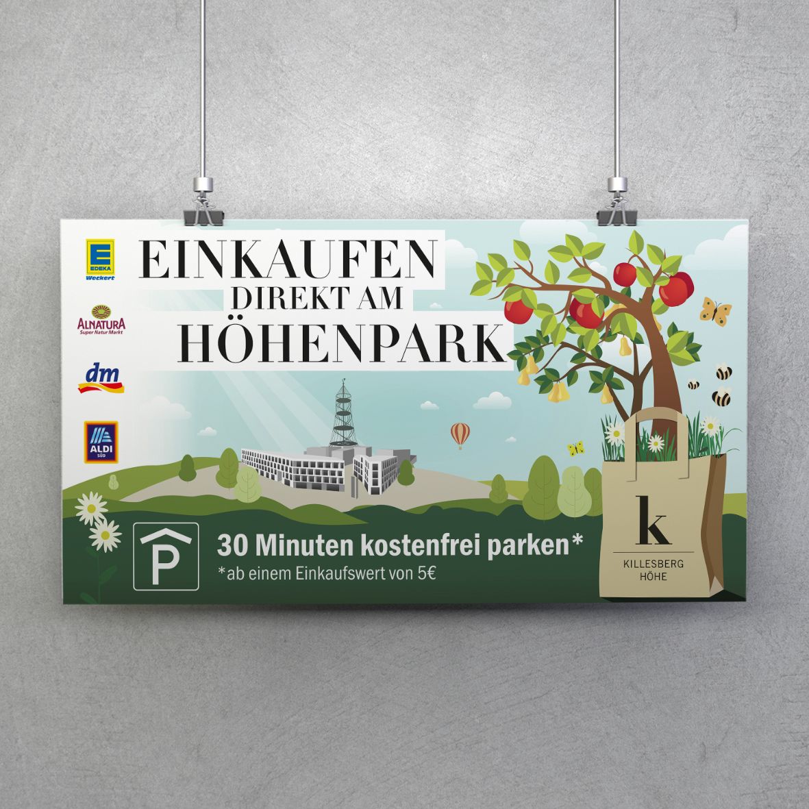
Killesberghöhe is a city district in Stuttgart, Germany. It incorporates shops, offices and living spaces and is situated directly at a park with its 40m observation tower. You can still find orchards with old pear and apple trees there and with the proximity to the park, nature plays a big part.
The brief
The brief was to create an illustration for its 10th anniversary with fruit trees growing out of a bag and to incorporate the main buildings, viewing tower and other aspects of the district. The focus had to be on the green setting and scenery.
The main purpose of the illustration was to be used on printed materials and tote bags and therefore needed to be adaptable to the different media.
graphic design
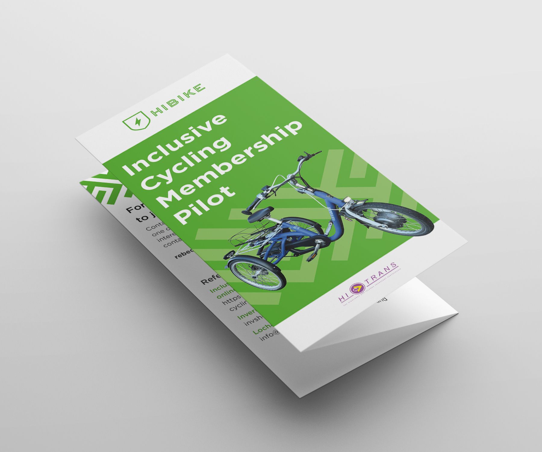
HITrans, Scotland
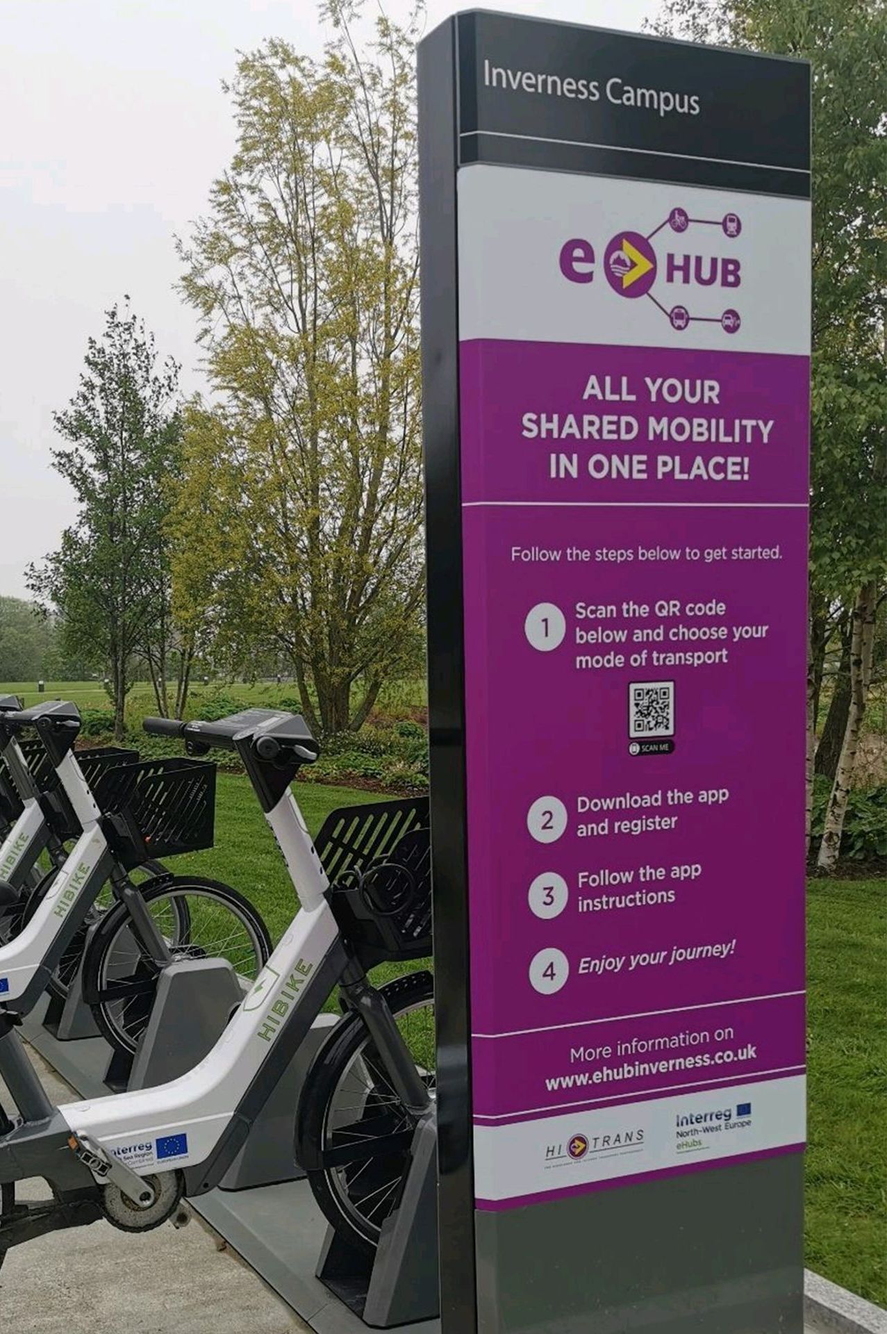
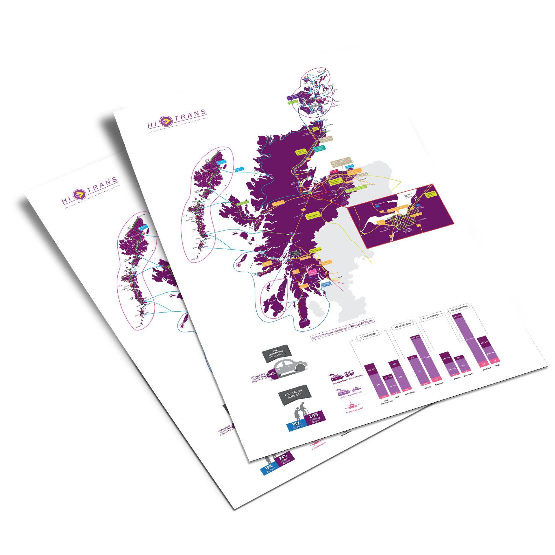
HITRANS (The Highlands and Islands Transport Partnership) is one of seven Regional Transport Partnerships in Scotland and supports various transport projects and travel partnerships.
The brief
Whether a project is for HITRANS direct or one of their partners, the mainly printed materials have to adhere to guidelines, create a consistent look throughout the individual brands but still be appealing and eye-catching. This includes leaflets, signage, business plans and annual reports.
Interpretation boards and illustrations
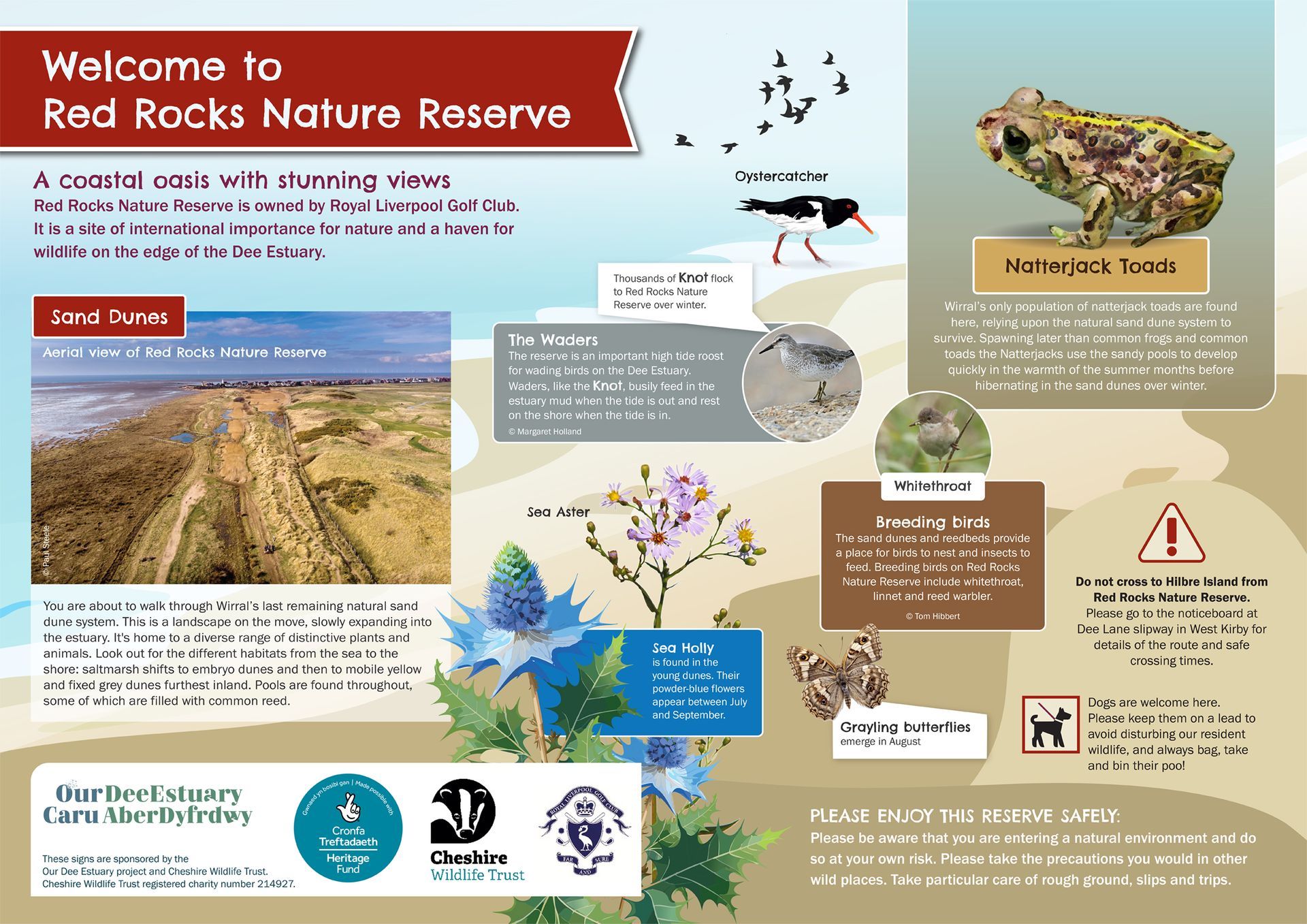
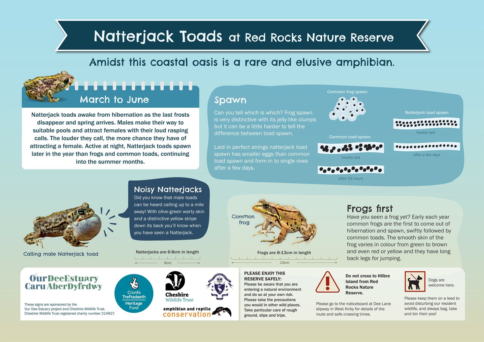
Cheshire Wildlife Trust - Natterjack Toads
The Cheshire Wildlife Trust manages and protects huge swathes of land and areas across the Irish Sea and Dee Estuary.
The brief
The Cheshire Wildlife Trust required three interpretation boards explaining the uniqueness of Red Rocks Nature Reserve and Natterjack Toads. The designs needed to complement existing boards at the Dee Estuary and Talacre, North Wales and be family-friendly. The sign for North Wales also needed to be bilingual.
- Red Rocks Nature Reserve
- Natterjack Toads at Red Rocks Nature Reserve
- Natterjack Toads at Talacre, North Wales (in cooperation with Denbighshire County Council
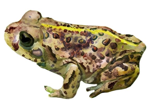
Together with the design of the boards, naturalistic illustrations of the toads and other wildlife were created to explain these exceptional sites and creatures.
Branding and Graphic design
Cyclorise Ltd
Cyclorise Ltd was a UK-based B2B & B2C cycling distributor, specialising in the import of high-end bikes, parts and accessories with an emphasis on performance, many of them originating in the US.
The brief
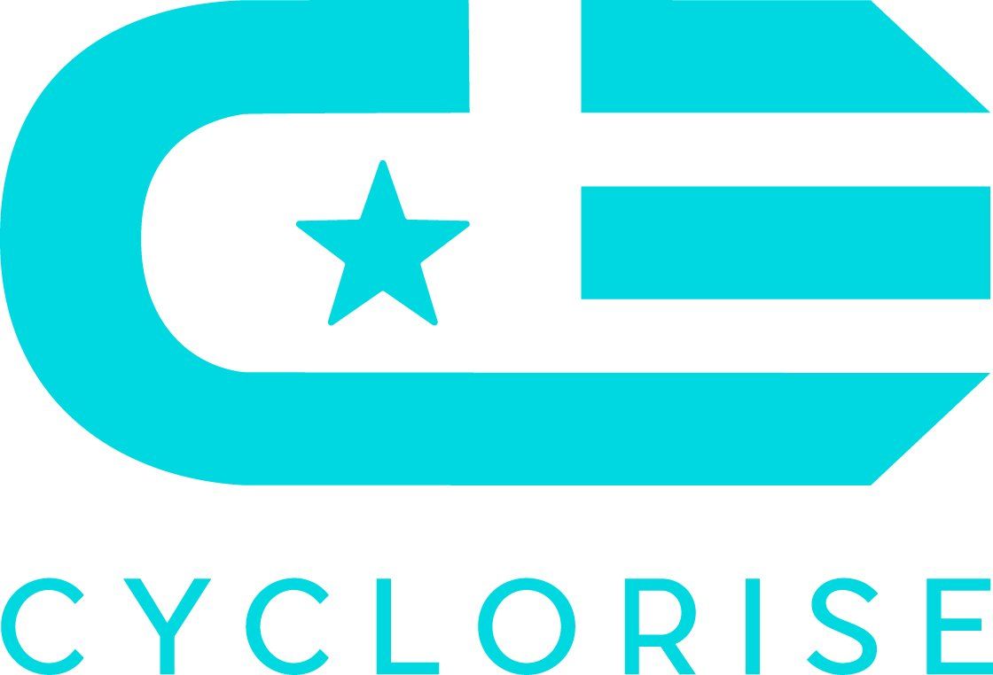
The brief was to redesign the existing brand and give it a modern, high-quality look but keeping the existing colour palette. The final logo incorporates various aspects of the company: the "C" from the name; star and stripes to represent the mainly US-based brands they distribute, and the stripes to symbolise a tyre tread.
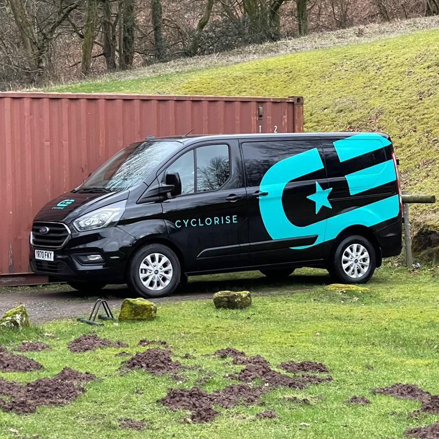
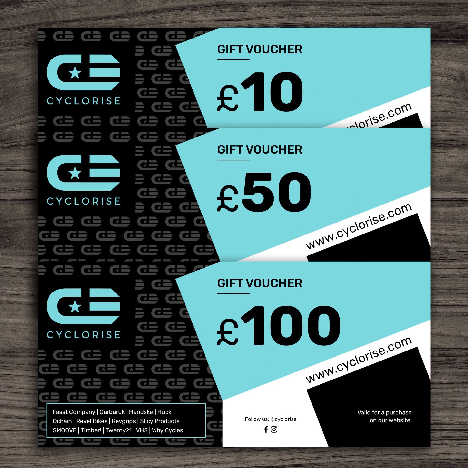
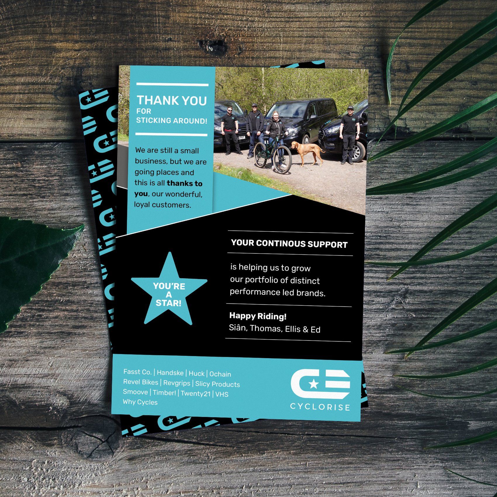
The new branding was then rolled out across various media, including packaging, design for print, van liveries, web and social media.
Graphic design
Nelson Hotels & Inns
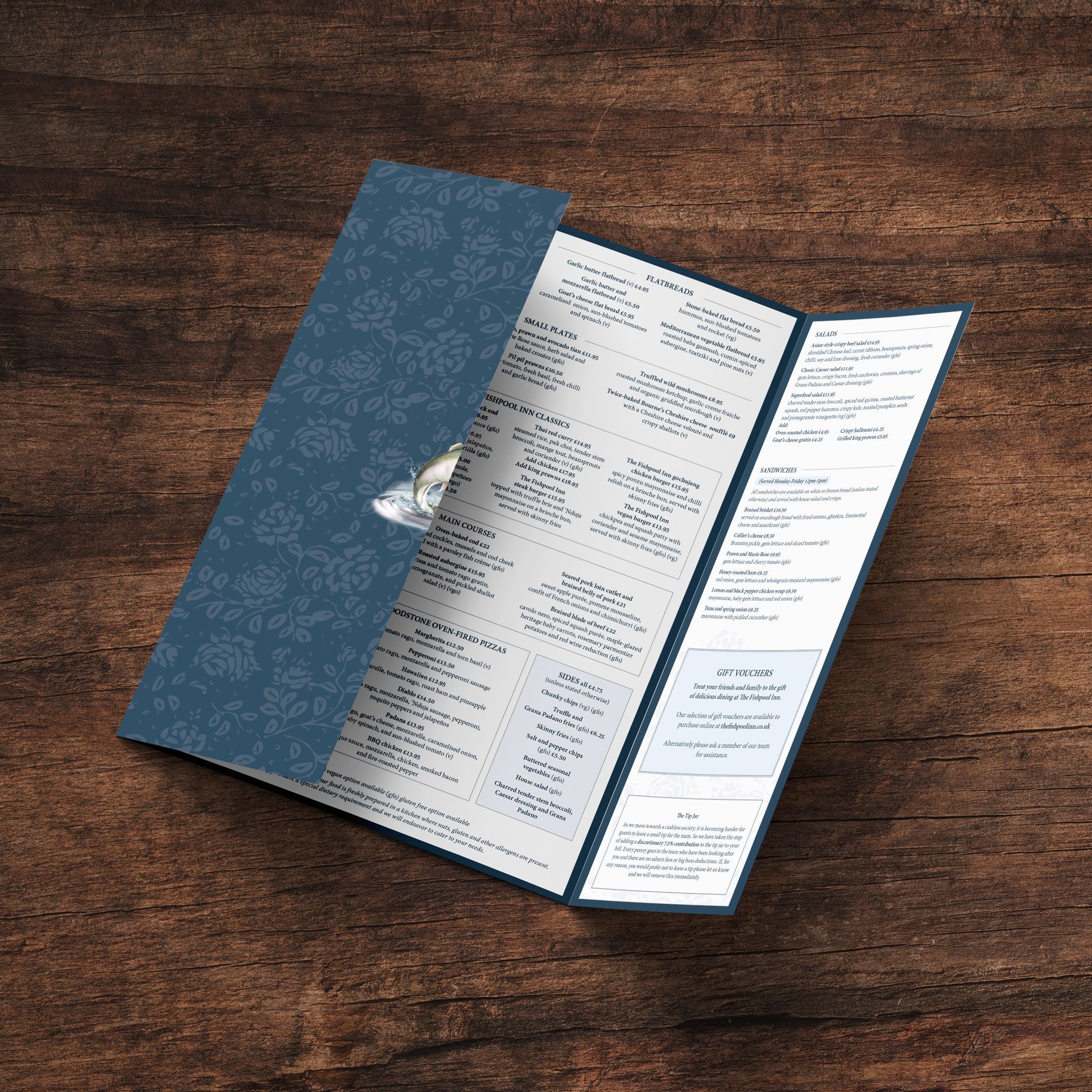
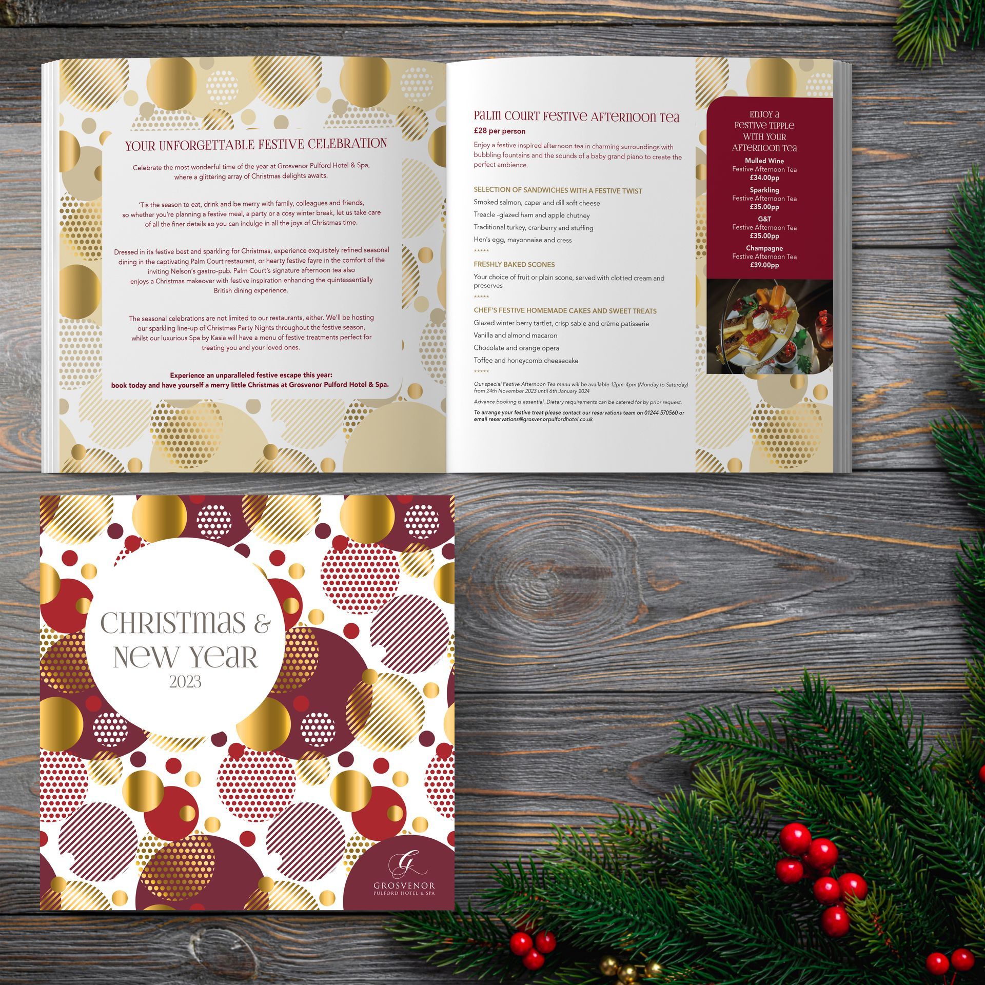
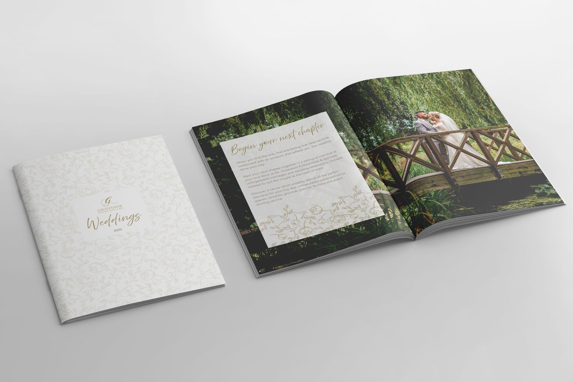
Nelson Hotels & Inns owns and operates a collection of contemporary hotels, inns, restaurants and a spa across Cheshire.
The brief
I have been working with Nelson Hotels & Inns and their various properties for many years, some of them since they first opened.
The main task is to update the day-to-day materials and maintain a coherent look and feel while creating new designs for events throughout the year.
Let's start a new project together! Drop me an email.
